Can “Predictable Delivery” be measured?
Five statistical techniques for turning delivery history into forecasting confidence.

This post was originally published in Engineering Enablement, DX’s newsletter dedicated to sharing research and perspectives on developer productivity. Subscribe to be notified when we publish new issues.
An engineering leader recently asked me how to measure whether their team is predictable in their software delivery. While organizations collect many engineering metrics (cycle time, throughput, review latency, deployment frequency, etc.), there is rarely a single metric that directly measures predictability.
The central question is:
Can we use the metrics we already collect to quantify delivery predictability?
Higher delivery predictability enables more accurate release planning, resource allocation, dependency management, and stakeholder communication. Improving predictability is therefore not simply about increasing throughput; it is about increasing confidence in engineering plans.
Key observation
Delivery predictability is not another engineering metric; it is a statistical property of a delivery process.
Traditional metrics tell us how much work teams complete or how long work takes. Predictability tells us, given historical performance, how confidently can we forecast future delivery? Predictability is a measure of uncertainty. For example, a team that consistently delivers 20 work items each sprint is highly predictable. A team that alternates between delivering 5 and 35 work items may have the same average throughput, but is far less predictable. The distinction is not average performance. It is variation.
A note on two lenses. “Delivery predictability” can mean two related but distinct things. The first is flow stability: how consistent and low-variance a team’s delivery is over time. The second is commitment reliability: how closely actual delivery matches what was committed (a ratio of committed vs. completed work). This article focuses on flow stability, because it can be derived directly from the metrics most organizations already collect.
Example
Let’s walk through a practical example of two hypothetical teams’ count of completed work items, by sprint:
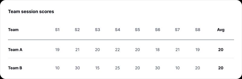
Both teams deliver exactly the same average throughput. The difference is that Team A is predictable while Team B is not. The remainder of this article describes several statistical techniques that quantify this difference.
What different statistical techniques tell us
The following statistical techniques each answer a different question about delivery predictability using the Team A and Team B example.
Standard deviation
Standard deviation measures how much a team’s delivery typically varies from its average. A low standard deviation means delivery is consistent from sprint to sprint, while a high standard deviation indicates greater volatility.
In our example, both teams average 20 completed work items per sprint. However, Team A’s delivery stays tightly clustered around that average, while Team B swings between 10 and 30. Team B therefore has a much larger standard deviation, despite identical average throughput.
Leadership takeaway: * * Standard deviation answers the question, “How much does this team’s delivery naturally fluctuate?” It is often the simplest way to quantify delivery consistency.
Coefficient of variation
Standard deviation alone can be misleading when comparing teams of different sizes. A team delivering 80 ± 5 work items is more variable in absolute terms than Team A (20 ± 1.3), but proportionally it is just as predictable.
The coefficient of variation normalizes the standard deviation by the team’s average throughput, allowing comparisons across teams regardless of scale.
Although Teams A and B have the same average in our example, this measure becomes valuable when comparing organizations with very different delivery volumes.
Leadership takeaway: * * Which teams are most predictable relative to the amount of work they deliver?
Percentiles and distribution shape
The sections above use throughput per sprint. Percentiles are most illuminating on a per-item measure such as cycle time, the number of days a work item takes to go from started to done, so this section shifts to that lens.
Averages describe the typical case, but predictability is usually broken by the atypical case. Percentiles, rather than the mean, show how often delivery runs long and by how much.
Consider two teams that both have a median (P50) cycle time of 4 days. If the first team’s 95th percentile (P95) is 7 days while the second team’s P95 is 21 days, they are not equally predictable. The first team’s slowest work is only modestly slower than its typical work. The second team’s slowest work takes three weeks, even though half its items finish in under four days.
The gap between P50 and P95 is, in effect, a predictability measure of its own. A tight gap means most work behaves like the typical case. A wide gap means the typical case tells you little about the work that actually puts a commitment at risk.
This is why a healthy median can still mask an unpredictable process: it is the tail, not the middle, that causes missed forecasts.
Leadership takeaway: When we commit to a date, are we planning against the typical case or the realistic worst case? Percentiles let us answer, “X% of work of this type finishes within N days,” a far more honest basis for a forecast than an average.
Statistical process control (control charts)
Control charts answer a different question. Rather than measuring overall variability, they determine whether a delivery process has fundamentally changed.
Suppose Team A suddenly delivered 9 work items in Sprint 4 instead of its usual ~20. While the average throughput might not change much immediately, a control chart would likely flag Sprint 4 as outside the team’s normal operating range.
This often indicates that something meaningful occurred, such as a production incident, staffing change, organizational restructuring, or dependency bottleneck.
Leadership takeaway: Did something change that warrants investigation, or is this simply normal variation?
Prediction intervals
Prediction intervals translate historical variability into forward-looking planning confidence. Rather than forecasting that Team A will complete exactly 20 work items next sprint, we estimate the range it is likely to land in.
Using a 95% prediction interval, Team A is forecast to deliver roughly 17 to 23 work items next sprint. Team B, with the identical average, is forecast at 0 to 40.
That second range deserves a moment. Team B’s forecast spans from delivering nothing to delivering twice its average. It is technically correct and completely useless for planning, which is precisely the point. Team B does not have a throughput problem. It has a forecasting problem, and no average will ever surface it. Notice that neither team’s average changed. Only the confidence around that average did.
The practical implication is that interval width, maybe more than the forecast itself, is the thing worth tracking over time. A team whose range narrows is becoming more predictable, even if its average never moves.
Leadership takeaway: How confidently can we forecast future delivery, and how wide is the range we should plan against?
Beyond the spreadsheet: machine learning
Everything above can be done in a spreadsheet. That’s deliberate. But if you have the data volume and the appetite, traditional machine learning (not LLMs) extends three of these techniques in genuinely useful ways.
Conditional forecasting. The prediction intervals above are team-level, with one range for everything the team does. Quantile regression forests and conformal prediction produce intervals conditioned on the specific item. Given its size, component, and the current queue depth, this work finishes in 3 to 12 days with 90% confidence. That’s a better input to a release plan than a team-wide average.
Survival analysis for work in flight. Cycle time statistics only describe items that have already finished, which quietly biases the picture toward work that went well. Survival models handle still-open items correctly and answer the question planners actually ask: what is the probability this item ships before the release date?
Driver attribution. Identifying what explains variation is hard, and the place modeling can really earn its keep. A gradient-boosted model with SHAP values can rank which operational signals (review latency, WIP, incident load, dependency count) account for the most variance in delivery. Treat the output as associational and as a hypothesis generator, not as evidence of cause.
Two caveats. Many teams don’t have enough history for any of this. Eight sprints is a worked example, not a training set. And the second caveat is that you need good workflow data hygiene. A model trained on tickets that sat in “In Review” for three weeks after they were actually merged will confidently forecast fiction.
Start with the spreadsheet.
Recommendation: Avoid a single predictability score
While it may be tempting to distill delivery predictability into a single score, I recommend against doing so. A single number simplifies reporting, but it can also obscure important differences between teams and make it difficult to identify the underlying causes of delivery risk.
For example, teams may all receive similar scores while exhibiting fundamentally different delivery characteristics:
- Consistently fast – High throughput with low variability.
- Consistently slow – Lower throughput, but reliable and predictable.
- Highly variable – Similar average performance, but large sprint-to-sprint fluctuations.
- Steadily improving – Predictability changing over time as the team’s delivery process matures, which a point-in-time score hides entirely.
Rather than reducing predictability to a single KPI, I recommend reporting three complementary views:
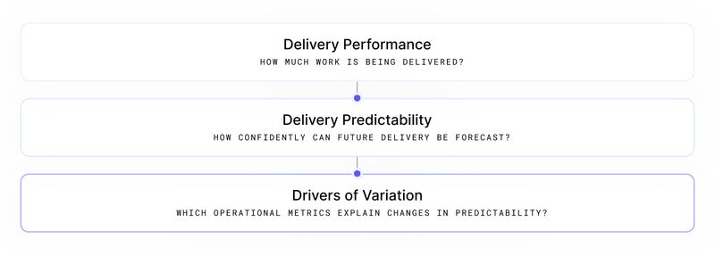
This approach preserves the information leaders need for planning while providing engineering teams with actionable insights into where process improvements will have the greatest impact.
Recommendation: Use a multi-step approach
I recommend measuring delivery predictability in four steps:
- Select a delivery outcome. Choose a metric that represents delivery performance, such as throughput, completed work items, cycle time, or PR completion time.
- Measure historical variability. Quantify how consistently that outcome is achieved over time using techniques such as standard deviation, percentiles, and control charts.
- Forecast future delivery. Use prediction intervals to estimate a range of likely outcomes rather than relying on a single point estimate.
- Identify the drivers of variation. Use existing engineering metrics, such as review latency, incident load, build reliability, focus time, or team composition, to explain changes in predictability and surface opportunities for improvement.
The goal is not to eliminate variation, but to understand it well enough to plan around it.